
Grid
Overview
The grid widget displays query or dataset results in a table format on the dashboard. Use it to view raw data as-is or to aggregate and summarize data into tables using pivot tables. It supports various field types including numbers, dates, and IP addresses.
For general information about query widgets, see Query widget.
Grid settings
The grid widget does not have a separate chart settings modal. Configure rows, columns, and filters in the pivot table editor, and the results are displayed as a grid.
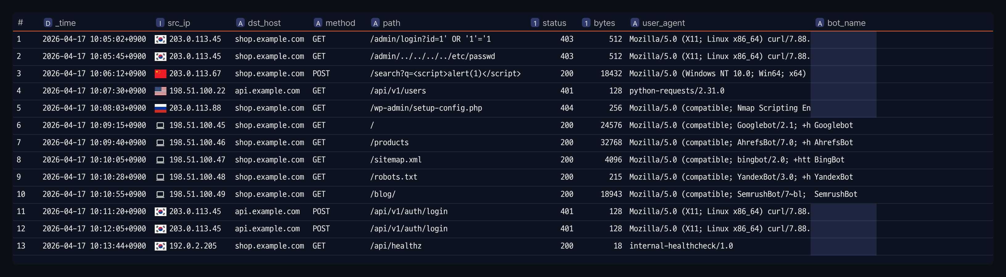
Pivot table editor
For instructions on using the pivot table editor, see Pivots.
Widget basic information
For basic information settings of the grid widget, see the left panel items in Query widget.
View cell details
When a cell contains long text or a large JSON/array value, the grid shows a preview and lets you open the full content in a modal using the more (⋯) button. The same behavior applies wherever the same grid component is used, including query results and parser results, not just the dashboard grid widget.
Cell preview rules
- Text or number: If the cell content exceeds 1,500 characters, only the first 1,500 characters appear in the cell, along with a more (⋯) button. The more button is shown based on the character count, not the column width, and it applies to number-type cells as well as strings.
- Array or object: If a value has more than 10 items, only the first 3 are shown as a preview, along with the more (⋯) button and the total item count. Even if the value has 10 or fewer items, if its serialized string exceeds 1,500 characters, only the first 1,500 characters appear, along with a more (⋯) button.
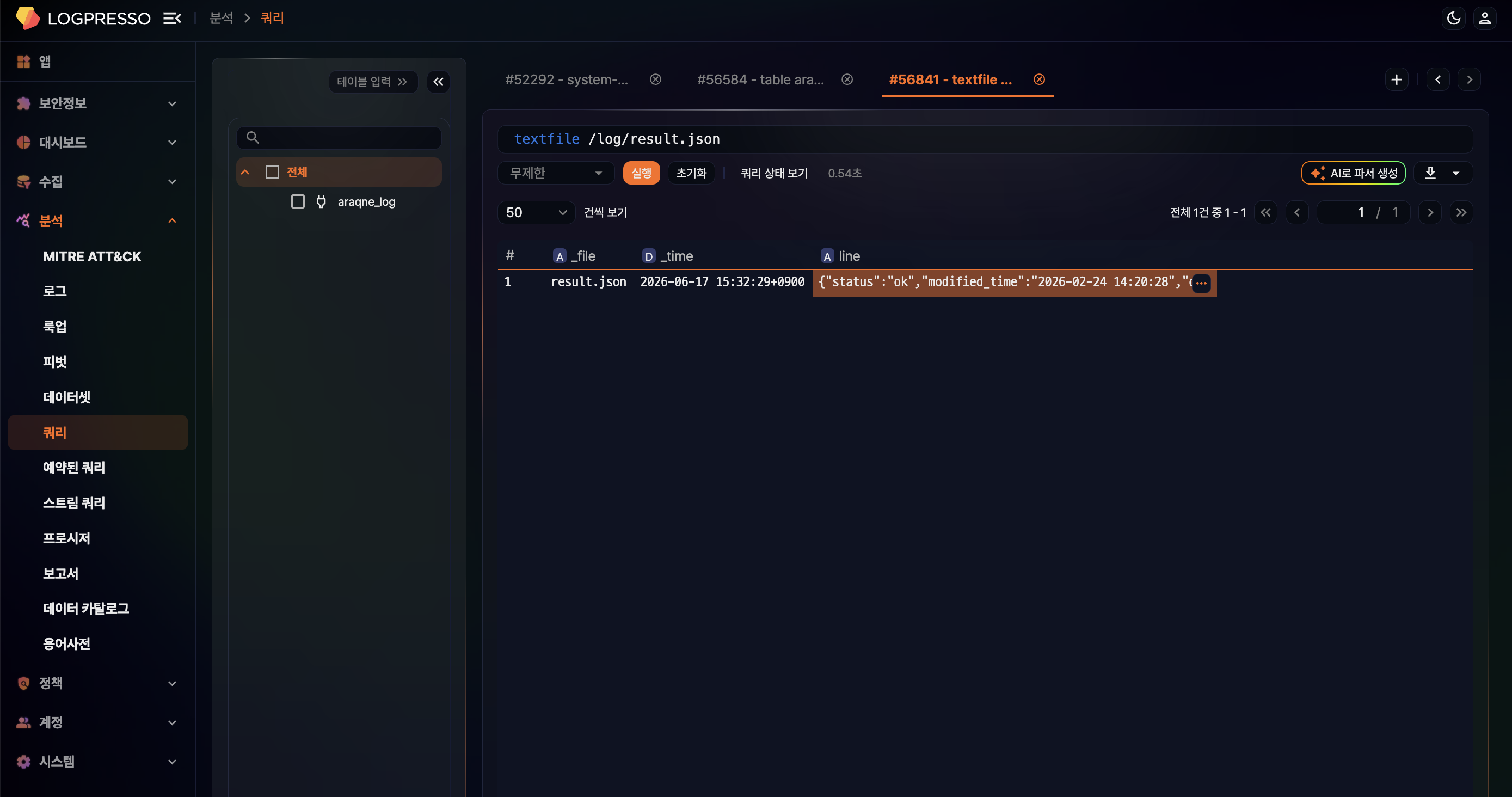
Cell detail modal
Use any of the following to open the full cell value in a 600x600 modal:
- Click the more (⋯) button on the cell.
- Select the cell and press Shift+V.
- Right-click the cell and choose View more.
JSON strings stored as text are also rendered as a JSON tree viewer in the modal. The tree expands up to 50 levels of nesting, and when expanded, unnecessary brackets are hidden so the structure is easier to scan.
